Friday, December 19, 2014
My Typeface
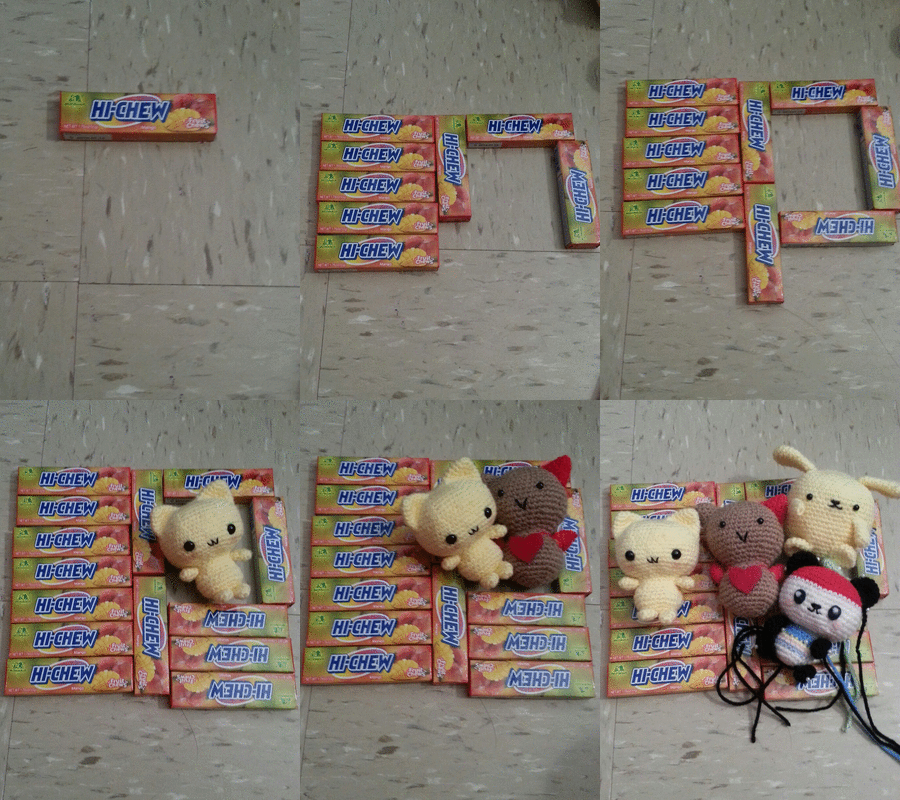
If I was a font, I would choose Churli Cute because this font is very cute and yet simple.This font include all type of emotions that I would go through everyday. I feel connected and attracted to this font because there were times that I am happy, sad, angry, frustrating, relaxing etc. Also, I was attracted to the carton character on the side of the font because I love drawing cute cartoon characters or animals. Through past project, I have always draw cute things such as panda and making sleeping cat GIF. A main component/theme in my projects is cuteness and this font really present this kind of idea. This also reflect on my interest of crocheting stuffed animals. I feel like this font represent me in many ways.
Logo Question and Summary
What are the goal of Cooking Club?
What is the purpose of the club?
What would you like to include in the logo that represent the club?
When did the club start?
What type of food do you cook?
Summary:
Cooking Club start in 2012 as Ms. Erlij as the founder. The goal of the club is to practice skills of cooking and to have fun with it. The club tend to make good food by trying new recipes and including healthy and filling ingredients. It was a opportunity for students to learn how to cook while cooperating with other students. The club member meet once a week and be given a new recipes once they get to the club and they follow the recipes. Students have the chance to try out different skills of cooking, such as cutting vegetables, washing food and using the different tools for cooking. They cook pasta, chicken, tacos etc. Something that should include in the logo are some kind of food, tools, ribbons. Just make it look like a presentation of dish. Also, the logo should somehow represent togetherness and make it fresh and clean.
Tuesday, December 16, 2014
Favorite Logo
One brand that I enjoy the most is Starbucks which is an example of combination marks. I think the logo is well designed because it is very straight forward and tells you what the symbol means. I very like the idea of using the words "Starbucks Coffee" surrounding the image of a "twin-tailed mermaid"that represent Siren or Greek mythology. Overall, I think the image is very attractive and pretty.
I think this logo is well design because when I first see this logo, I think the design is very cute and attractive. The logo contains a a shopping bag design that symbolism shopping. The fact that it put on a glasses and mustache on the bag shows that people should shop wisely and buy the stuff that they really like or benefit for them or last long etc. This logo is also very straight forward because it incorporate the text "Shop Wise". I think the focus of this logo is shop "Wise" since the font is bigger than the phase "Shop".
Wednesday, December 10, 2014
Portrait Transformation
![]() |
| Before |
![]() |
| After |
Concept:
My concept for this portrait transformation project is car-lover. I use my brother as the figure because my brother love playing car and he has many cars at home. So, from my original photo, I delete the background picture, left with an blank background. I use the clone stamp tool on the jean to make the grass less visible. I also use the curve adjustment and layer mask to make my brother 's face look whiter. After that, I drag in the background image of a room. Then, I drag in photos of cars I found online and some I take at home. I enlarge the blue car and shrink my brother, so my brother can sit on top of the car. Then, I shrink the different cars and make it into a heart shape surrounding my brother. This way it shows my concept of car-lover.
Friday, November 21, 2014
Shape to Symbol GIF & Reflection
Concept: Sleeping
While using the Photoshop, the most frustrating aspect of the project was creating transitional layers because it was difficult to transition from a shape to my symbol. At first, I starts off with a oval shape and my next layer was a head and a body attach together. So, when creating my animation, I tween the shape frame and head with body frame to create multiple new frames between them. However, the transition was not smooth because the outline of oval shape overlapped the other the frame when the oval shape was fading out. At that time, I don't know what to do and Ms.Lee give me a suggestion of shrinking the oval shape multiple times to transition to the cat's head. After doing that, my transition look much better and smooth. The process of transition between the frame very frustrated because I had a lot of details for my symbol. Also, I had many layers that transition from a basic shape to a more detail shape such as a half circle ear to a cat ear. So, sometimes I was confused and frustrated because I had to hide different layers for different frame.
After completing the project, I feel most confident in using the selection tools, painting tools and rectangle tools. I feel like I am getting better at using the lasso and rectangular marquee because I have try adding and deleting selection when creating the cat ear shape and the arms. I used the rectangle tools often while creating the basic shape of the cat, the book and adding details of the book. In addition, I used the brush to create the eyes, eye brows and to draw the cat ears and the arms to make it look better after using the lasso tool. The paint bucket was used often to fill in the color of different part of the cat.
I wish I was better at the pen tools because I experiment that tool when creating the cat ear. I used the tool to add and delete anchor point to help me draw a smooth-edged of the cat ear. However, I felt like this tool was difficult to use because it not easy to make a smooth-edge and to change the anchor point to make way you want to be.
For the next Photoshop project, I want to try altering different images to create a new image. I think this will be a new experience for me especially I never edit a photo in Photoshop. I think it will cool to have different layers of multiple images that create a a unique photo comparing to the original photos. I also want to draw again using the pen tools because it was difficult to maintain a steady hand when drawing on the computer. So, I want to experience with the pen tool again in the future.
Monday, October 27, 2014
Tuesday, October 21, 2014
Concept Board and Research
Marian Bantjes
(www.designishistory.com/2000/marian-bantjes/)
-a designer, typographer, writer and illustrator
-I am attracted to her design because of her different ways of designing the heart shape. Also, her design is very detailed and contains a pattern as well as highly ornamental style.
Research:
Forms or Movement/Inspiration that influenced her: Admire:
-mediaeval manuscripts/ illuminated manuscripts -Eike König
- islamic art -Chris Ware
-14th–18th calligraphy -Robert bringhurst
-art nouveau -Ricky Jay
-the Arts & Crafts movement -Naomi klein
-typography -Ed Fella
-textiles from around the world
-old lace
-Baroque
-Rococco or Gothic anything
-ornament
She was born in 1963 and grew up in Saskatchewan. At first, she thought that she will become a “commercial artist” and at that point, she never heard of graphic design. Then, she gave up of being an artist. After she dropped out of art school, she works with publisher Hartley & Marks where she helps to do general job and type-works. She learned typography from Hartley & Marks who trained her on XyWrite (a word-processing program). She first started recreating pencil-drawn, marked-out layout and learning about margin and gutters.It is a aptitude for computer typesetting that slowly influence the public and developed into the understanding of typography and design. Bantjes was clueless about different design and designer until she was asked to teach a class in typography that led her to research and learn about the design and history of typography where she learned different typeface.
Bantjes started working in the field of visual communication in 1983 and worked as a book typesetter from 1984–1994. She then opened her own design firm in 1944 and in 2003, she starts to experiment design of love that is highly personal, obsessive and sometimes weird.At the same time, she began writing the “Speak Up” and her cheeky and thoughtful articles help her gain recognition and soon, she caught the attention of other designers and art Director in North America. The “Speak Up” allow her to met new friends and shift her life focus from Canada to America. In addition, it let her realized her passionate about graphic design. Furthermore, she was often hired to create custom type of advertisements, magazines and special projects due to her unique style of typography and illustration includes extremely detailed letterforms, ornaments, lovingly precise vector art , pattern and has been featured in design publications all over the world. “Bantjes’ work contains an underlying structure and formality that frames its organic and fluid nature.” So, the combination of her style has drawn the interest of a wide variety of designers and typographers that lead them to teach and experienced formalists to students. Her design is still very influential to other designers and the world.
Subscribe to:
Posts (Atom)
.jpg)